£125.00
Film
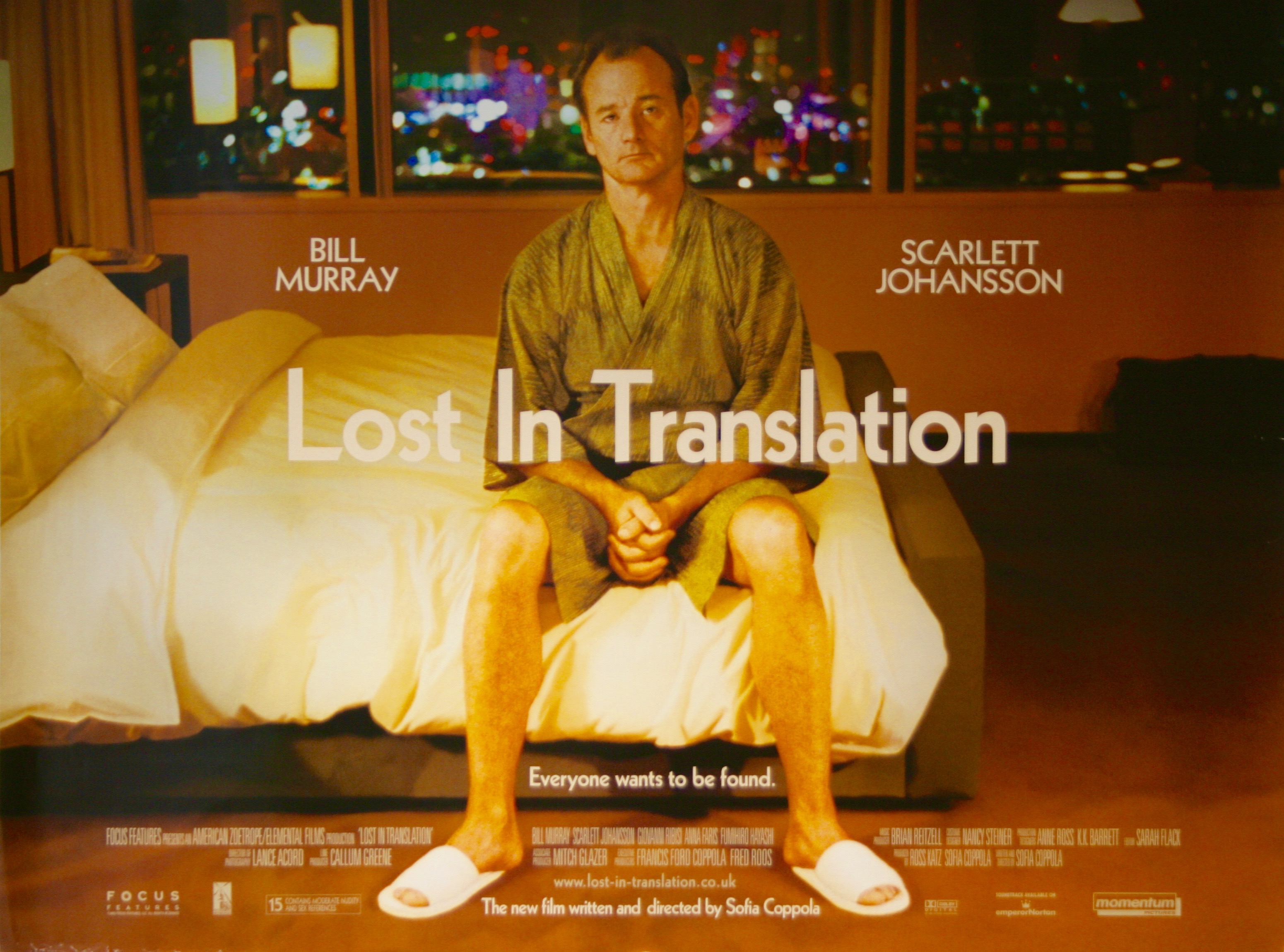
Lost In Translation
2003
UK Quad (30" x 40") Double Sided
UK / British
Near mint minus; originally rolled (as issued)
Sofia Coppola
Akiko Takeshita, Bill Murray, Catherine Lambert, Francois de Bois, Scarlett Johansson, Take
SOLD - this item is sold. Please browse our currently available stock
Sofia Coppola’s surprise hit of 2003 has been hailed as a modern masterpiece. Crew Creative Advertising’s imagery and design for the accompanying advertising campaign for “Lost in Translation” is equally enjoyable and was used globally; hugely memorable, everyone knows the movie after seeing Bill Murray in character as “Bob Harris” sitting forlornly in his hotel room; perfectly capturing the tone & look of the movie. The original UK quad film poster offered here presents to excellent effect. Being originally rolled (as issued) it displays superbly and is a great example for this thought provoking alternative romancer. Guaranteed original this rare film poster represents a fine piece of original movie memorabilia that is becoming increasingly hard to find.
Trivia: When Charlotte is riding the subway, she looks down at a man who is reading a comic called ‘Ghost in the Shell’. Scarlett Johansson would go on to star in a film adaptation of the comic in 2017, Ghost in the Shell (2017).
…more detailVintage Movie Posters Grading Criteria... read more +
It is not easy to talk about “Lost in Translation“. Sofia Coppola‘s second film as a director is in part about things we never talk about. While its two protagonists try to find mutual solace in each other, their silence is as expressive as their words. This is a film that believes that an individual can have a valuable relationship with someone else without becoming part of that person’s life. Here is an extract from Roger Ebert‘s great review of the film: “We all need to talk about metaphysics, but those who know us well want details and specifics; strangers allow us to operate more vaguely on a cosmic scale. When the talk occurs between two people who could plausibly have sex together, it gathers a special charge: you can only say “I feel like I’ve known you for years” to someone you have not known for years.”
In this marvellous story, the two lonely individuals that merge the illusions of what they have and what they could have are two Americans. The emotional refuge, Tokyo. We have Bob Harris (Bill Murray), and actor in his fifties who was once a star, and is now supplementing his incomes with the recording of a whisky commercial. On the other side of the telephone, a frightening reality: his wife, his sons, and the mission of choosing the right material for heaven knows what part of the house. When we consider Bob’s situation, we realise that Lost in Translation is also a meditation on the misery of fame. Certainly fame has great (perhaps greater than disadvantages) advantages but then there are the obligations, the expectations.
We also have Charlotte (Scarlett Johansson), a woman in her twenties who is accompanying her husband, a photographer addicted to work, on a business trip. But it could said it is as if she is alone anyway. Her world, just like Bob’s, is reduced to strange days in the bedroom, the corridors, the hotel’s swimming pool, and the bar, the perfect destination for victims of sleeplessness and wounded soul. The bar is the place Bob and Charlotte meet for the first time. They talk, little, but just enough. Once their dislike for parts of their lives are established, they begin sharing times that feel dead to be able to feel alive.
Bob and Charlotte are souls in transition for whom, surrounded and confused by exotic rituals, and a different language, allows them a moment to lose their identities. Both characters provoke similar feelings form different experiences. There are no kisses or crazy nights between them, but only a shared intimacy in which a night out, a walk in the streets, a session of karaoke becomes a powerful expression of their affection an complicity. The relationship we all await only happens in our minds and the protagonists, whom we are not allowed to know everything they say and desire. Tokyo metaphorically speaking is the third character in the film. The bright colours, the noise of the city…just everything evokes the various spiritual awakenings of the characters.
It ends on a perfect note leaving the relationship of the characters undecided. A rare gem in modern day cinema.

Trade Address:
Vintage Movie Posters (UK) Limited
The Malthouse
The Broadway
Old Amersham
HP7 0HL


© 2026 Vintage Movie Posters
Registered Office Address: Vintage Movie Posters (UK) Limited, Aston House, Cornwall Avenue, London N3 1LF GB
Registered Company No: 07664517
Mint
A poster that has never been used or displayed and may show the most minor signs of age and wear. The poster should have no holes or tears.
Near Mint
A generally unused poster with fresh, saturated colors. May have minimal tears at folds. Has no significant holes, no paper loss, may have minor tears along edges, may have fine pin holes.
Very Fine
A poster with bright colour and crisp overall appearance. It may have very general signs of use including slight fold separation and fold wear. It may have pin holes or very minor tears. This is the highest grade allowed for a poster that has been restored either on linen or on paper.
Fine
A poster with good colors and overall clean appearance. It may have minor tears small paper loss and minor stains. It may have some fold seperation.
Good
An average poster with overall fresh color. May have tears, minor paper loss, minor hazing. Paper may be brittle due to age, may have minor stains. May have a small amount of writing in an unobtrusive place. May have medium or major restoration.
Fair
A poster with faded colors and brittle paper, showing significant signs of use. May have tears and paper loss. May have tape, writing, stains in image area. In need of restoration or had major restoration.
Poor
A poster that is worn, torn, and/or damaged. May have staining, cracking, dry rot, and/or large tears. May be heavily soiled, may have pieces missing. In need of major restoration.
All photographs and images used on our site are photographs of the actual poster/item you are buying, we do not use stock photographs.
LOBBY CARD
11 x 14″ printed on heavy stock paper. Used as display in theatre lobbies. Originally made in sets of eight. Some sets have a title card, which contains credits and artwork, essentially a mini-poster. The remaining seven cards are coloured photographic credits and poster artwork showing different scenes from the movie.
WINDOW CARD
14 x 22″ printed on heavy stock paper with the top 4-6 inches usually left blank for the local cinema owner to fill in the cinema and the date it was due to play. Largely discontinued during the 1970’s.
HALF SHEET
22 x 28″ printed on heavy stock paper. The image displayed is normally a smaller version of the main poster, although some do have different artworks and sometimes come in two versions.
INSERT
14 x 36″ printed on heavy stock paper. Inserts usually have the same artwork as a one sheet. Popular with collectors since they are smaller and easier to frame. Normally come tri folded or rolled.
STYLE Y/FORTY BY SIXTY
40 x 60″ printed on heavy stock paper. Rare since they were primarily used for major motion pictures only. Designed to be used outside the theatre, on an easel, normally at a drive-in movie theatre.
ONE-SHEET
27 x 41″ printed on paper. This is the most common size of poster, intended to be displayed in a glass “marquee” case. It is the most sought after size by collectors. Since the 1980’s most posters are sent to the theatre rolled and maybe slightly smaller measuring 27″ by 40″ and with the advent of backlit light boxes a growing number of modern movie posters are available double-sided and the more traditional single-sided.
THREE-SHEET
41 x 81″ printed on paper. These were printed on two or three separate sheets designed to overlap, few survive. Used for larger advertising spaces, normally posted on walls, perfect for huge movie theatres the drive-in, where people could see them from a distance. From the 1970’s on, three-sheets were sometimes printed in one piece and issued as “international” versions to be used abroad.
BRITISH QUAD
30 x 40″ Most common poster size used in the UK. British Quads are horizontal and may have different artwork to the US one sheet. Like a US one sheet they normally come in two versions. Like a US one sheet they are usually supplied single-sided or more commonly now as a double sided poster.
BRITISH ONE-SHEET
27 X 40″, printed on paper. Very rarely used size.
ITALIAN LOCANDINA
13 x 28″ six inches shorter than the US insert, very nice size to frame. Italian poster illustrators are some of the best in the industry.
ITALIAN PHOTOBUSTA
18 x 26″ Glossy, high quality, used as lobby cards in Italy. Size may vary, either vertical or horizontal format. There are also double Photobusta or mini Photobusta.
2-FOGLIO (DUE)
(DUE): 39 x 55″ This is the standard poster size used in Italy. Italian poster illustrators are some of the best in the industry.
4-FOGLIO
(QUATTRO) 55 x 79″ Very large Italian poster printed in two pieces, often contains very beautiful artwork.
FRENCH
47 x 63″ (GRANDE) or 24 x 33″ (PETITE) French movie posters normally come with different artwork to either the US or the UK. Like the Italian’s some of the artwork is extrememly beautiful.